Garmin zūmo 660 – Part 4
Part 4: Riding With The Zūmo
I haven’t put the 660 through all its paces, yet.
But for typical riding activities – back home in the cooling north or down here in the wetter but warmer temperatures of the south, the newest zūmo is performing quite well overall..
Snapping the 660 into its cradle that is in turn mounted on the Touratech 660 cradle and securing the device by locking the security arm in place provides further protection for the instrument and, better security.
The absence of any locking mechanism or provision for using one with the OEM cradle continues to bug me.
With the power button pushed and the default screens dealt with, the system is ready for navigation in half the time the 550 still takes.
As well, the Quick Settings menu is a great feature that I use often to adjust screen intensity and audio levels on a moment’s notice.
Operating speed is much improved over the 550, especially the speed with which map and features are drawn and selected tools or features are presented.
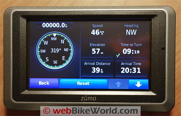
The large, sharp screen display is much appreciated.
Not only for the additional real estate but for general information viewing, especially since the default icon size has been increased.
The touch screen, at least to me, is more sensitive than many others, including the 550.
Some users lament the absence of input buttons along the sides of the chassis, as the 550 and the Navigator provide, and while I still (sometimes) think of these buttons when using the 660, I don’t really miss them.
From a general map display perspective, even with the latest map update installed, there are still far more gaps in coverage and errors in the database than I think are appropriate.
Like the 550 the system still seems to have trouble resolving route options or addresses, although a couple of the new routing enhancements, if used, can mitigate these issues to a large degree.
With light to medium gloves on, the touch controls work just fine, even the QWERTY keyboard can be manipulated without much issue.
However, if heavier gloves are being used or other conditions dictate, then the Large Mode or ABCDE layouts provide viable alternatives.
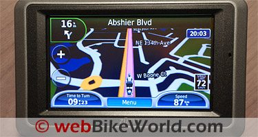
If the Media Player or Phone application are in use, small Blue Music or Handset icons will be displayed on the centre right of the map screen.
Touching either will bring up the applicable application for immediate use or application adjustment.
In keeping the 660 up to date via the WebUpdater, the device has never failed to securely pair with the assortment of Bluetooth communications systems and headsets on hand or with any of the Bluetooth enabled phones presented to it for hosting – so far, so good.
But on what is likely a related issue, my 660 keeps losing its Bluetooth, which results in having to do a full reset, with resultant loss of any data held on the device.
This is now happening on a regular basis and keeping the device fully updated has not resolved anything. And for what its worth, the issue only seems to raise its head when running on the internal battery.

Where to Buy garmin zumo 660
Check Reviews & Prices on Amazon Check Reviews & Prices On RevZillaSee More: Motorcycle GPS, Motorcycle Intercom, Motorcycle Accessories
What It Should Do
The zūmo 660 was released to a pretty expectant and pretty critical audience.
The anticipated fine-grain analysis and feature by feature comparisons have/are being made and depending on what article you read or forum one browses, the 660 is an abject failure; a clear cut winner, or a new device with potential.
I haven’t made up my mind yet.
In most regards. I find the 660 easy to use, as intuitive or more so than the 550, more relaxing to view and its processing performance is a big step up over the speed of the 550.
What I do miss, in a collective sense, are the features and tools that Garmin could have and should have provided.
Given a two year window to collect, analyze and review requirements, especially in light of a very large and active 550 user base, the next iteration should have been far more progressive and far more capable.
The fact that the 660 is priced at $100.00 less than the 550 is, to me, a big clue, even appreciating that some technology costs, along with production costs, have been reduced.
The zūmo 550 in many ways is still more capable than the 660; it is still (slightly) better in the trip planning department and it supports external radio interfaces.
As a user, the desired features are pretty clear to me.
Enhance and add more complex route planning tools, do some QC on the map data provided, provide interface capabilities other than the traffic services.
Also, allow for additional screen use by external peripherals and finally, if absolutely necessary, increase the retail price.
| Garmin zūmo 660 Review: | |
| ▪ 1: Introduction to the the zūmo 660 | |
| ▪ 2: Physical Tour | |
| ▪ 3: Where To? | |
| ▪ 4: Using the zūmo 660 | |
| ▪ 5: zūmo 660 Specifications | |
| ▪ 6: zūmo 550 vs. 660 Comparison | |
| ▪ 7: Installation | |
| ▪ Owner Comments (On Page 1) | |
More webBikeWorld:


No Comment